
5 College Website Design Trends to Know
Higher education websites are crucial information hubs for colleges and universities. These websites must appeal to a wide range of audience members, including current and prospective students, parents, alumni, faculty members, community members, and more.
To accommodate such a wide variety of visitors, your university’s website must take advantage of current trends, innovations, and user experience best practices. Creating a positive user experience will help your website stand out and enable audience members to easily find what they’re looking for.
In this post, we’ll look at five college web design trends to keep in mind as you update your university’s website:
- Improved accessibility.
- Enhanced user journeys.
- Interaction and social media engagement.
- Eye-catching, inclusive visuals.
- Strong focus on alumni giving and engagement.
According to Kanopi’s higher ed web design guide, the COVID-19 pandemic led to a major shift in the way colleges and universities used their websites to connect with students. Even when in-person tours and other interactions were put on hold, students could still get the information they needed online using higher ed websites.
Many of the changes that were already in motion became more urgent during the pandemic, becoming higher ed web design norms. Let’s take a closer look at a few of those innovations now.
1. Improved accessibility.
Let’s be clear—accessibility isn’t a trend for higher education websites; for institutions that receive federal financial aid, it’s the law. However, the way that colleges and universities are approaching accessibility has been much more comprehensive over the past couple of years. Higher education institutions are placing accessibility high on their list of website priorities and taking tangible steps to create more inclusive websites.
Higher ed websites often include their accessibility commitments in their menus and provide opportunities for visitors to report accessibility issues. Websites like the University of Notre Dame even provide robust web accessibility guidelines to help other websites become more accessible.
Other notable accessibility improvements include:
- Ensuring there is a sufficient color contrast between text and background.
- Including descriptive alternative text for images.
- Incorporating pause and caption functionality for videos.
- Clearly labeling all form fields.
To assess your website’s accessibility, you can use testing tools such as Lighthouse and Siteimprove. You should also test your site’s accessibility manually to ensure that your testing tools didn’t overlook anything. Navigate the site using just your keyboard or zoom in to 200% and review your content to replicate the experience of using assistive technologies.
2. Enhanced user journeys.
As mentioned, college websites must appeal to a broad audience of visitors with varying needs and interests. Top college websites like Loyola Maryland, The University of Pittsburgh at Bradford, and the University of Arizona offer clear user pathways for visitors to quickly access the information they need.
Let’s take a closer look at how each site optimizes the user experience:
- Loyola Maryland’s homepage CTAs offer pathways for undergraduate, graduate, and continuing education studies. Each CTA leads visitors directly to additional information and links that help them learn more about their educational opportunities.
- Pitt-Bradford’s main navigation menu includes an “Info for” section with links for current students, incoming students, parents, faculty and staff, alumni, community, veterans, and giving. These user pathways address any and all possible visitors, providing a more personalized experience for audience members.
- The University of Arizona website includes an “I am” dropdown menu in the fixed top navigation menu. Visitors can select whether they are a future student, current student, faculty or staff member, parent or visitor, alumni member, donor, business, or school partner.
The way each of these websites approaches user pathways is unique, but they all accomplish the same goal of creating a more streamlined browsing experience for any visitor. Consider your higher ed website’s main audiences and how you can create convenient, streamlined user experiences for them.
3. Interaction and social media engagement.
As noted, the COVID-19 pandemic meant many student engagement activities that were once in-person had to move online. To continue engaging their communities, college websites became informational hubs for virtual engagement opportunities, news updates, pandemic-related content, and more.
Social media also became an important way to stay in touch. For example, check out how the Rhode Island School of Design Alumni website features its latest social media posts at the bottom of the homepage. Including updates like these on your university’s websites helps create cross-channel interactions and allows audience members to engage on more than one platform.
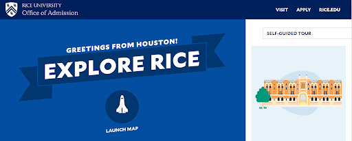
Also because of the pandemic, virtual campus tours became a staple for prospective new students. Colleges like Rice University took virtual tours to the next level with fully interactive, user-driven experiences. These resources gave new and prospective students the information they needed, even if they have yet set foot on campus.
Adding interactivity to your college website can enhance the visitor experience and turn your site into a more valuable resource for prospective students.
4. Eye-catching, inclusive visuals.
Strong visuals tend to be much more engaging than just text alone, especially images that show faces. The human brain is wired to be responsive to visual stimulation, allowing us to process visual information 60,000 times faster than text.
University websites are taking this phenomenon seriously by centralizing large, eye-catching visuals that showcase the diversity of student life. For example, take a look at how the Kenyon College homepage is dominated by a single photo representing campus life.
Dominant homepage videos are also in vogue— the University of Alabama and Xavier University websites both feature automatically-playing homepage videos that showcase campus and academic life. Both websites also get points for accessibility since they include pause buttons on their videos.
Whether you use videos, photos, or other visuals, ensure the images you choose accurately represent your institution and include accessibility elements such as pause buttons and alternative text.
5. Strong focus on alumni giving and engagement.
University websites are taking notes from the best nonprofit websites and maintaining a strong focus on alumni engagement and giving.
Many universities, like the University of Georgia, have separate alumni-focused websites with calls to action (CTAs) to keep alumni engaged in their university’s activities. Check out these CTAs on the UGA Alumni website:
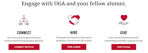
These buttons provide alumni with easy access to multiple ways to engage, including connecting with fellow graduates, recruiting recent grads, and donating.
Alumni online giving opportunities are also distinguished for their flexibility. From employer giving opportunities to stock transfers and planned gifts, alumni can choose the giving option that works best for them.
As you update your university’s website, consider how you can keep your alumni giving and engagement opportunities front and center. Double the Donation’s nonprofit web design guide recommends creating a streamlined online giving process by:
- Optimizing your website and online giving form for mobile devices.
- Linking your website with your alumni database to seamlessly transfer data between platforms.
- Featuring your donation button prominently throughout your site, including within your main navigation bar and on your homepage.
A multichannel outreach strategy is also critical for improved alumni fundraising. This allows you to reach a wider audience of prospective alumni donors. Connect your website to other marketing platforms by including a link in your emails and social media posts. Make sure your marketing campaigns are branded uniformly across all platforms to create stronger brand recognition.
Just like any genre of web design, university web design is constantly evolving to make use of innovations and best practices. However, we predict the innovations in this post are here to stay. Whether you’re designing your website to promote giving opportunities or appeal to diverse audiences, accessibility, user-friendliness, interactivity, and strong visuals will always be key. Happy designing!
About the Author

Anne Stefanyk
As Founder and CEO of Kanopi Studios, Anne helps create clarity around project needs, and turns client conversations into actionable outcomes. She enjoys helping clients identify their problems, and then empowering the Kanopi team to execute great solutions.
Anne is an advocate for open source and co-organizes the Bay Area Drupal Camp. When she’s not contributing to the community or running her thoughtful web agency, she enjoys yoga, meditation, treehouses, dharma, cycling, paddle boarding, kayaking, and hanging with her nephew.
https://twitter.com/Anne_Kanopi
